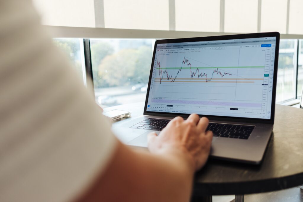
As we all know charts are very important in decision making for traders or investors, as these are the indicators to know the right price. There are many types of charts in technical analysis for technical analysis. Each chart has its unique function and is plotted on the X and Y axis.
In this section, we are going to understand what charts are so important, different types of charts in technical analysis, and much more.
Why Charts are Important?
Technical analysis is the study of price movement using different indicators where charts represent the relationship between price and time. Charts are the only method for traders to study the past price movement of the assets, while investors have other options eg balance sheets, and annual reports to study the asset. But if investors combine fundamentals (balance sheet, annual report) and technicals (chart analysis) then it is like a “cherry on top”. So charts are important for everyone who is involved in trading and investing in the financial market.
Some of the key reasons, why charts are important are the following:
To Find Trend
Trend is the fundamental concept of technical analysis and traders use charts to identify the current trend, whether the trend is an uptrend, downtrend, or sideways trend. If you are reading this article, you heard “Trend is your Friend” and don’t trade against the trend.
Visualization of Data
As we have already studied in earlier articles, charts provide us with visual clarity of complex data, If you have not checked it out then go and check A Brief Introduction to Charts in Technical Analysis.
Identification of Patterns
Charts are used by traders to identify the formation of different patterns eg head and shoulder, cup and handle, double top, double bottom, etc. Traders use these patterns to enter into the trade.
To identify Support and Resistance
Support and Resistance is the major part of price action in technical analysis. We can easily draw support and resistance on charts, especially on Line Charts.
Technical Indicators
Technical analysts overlay charts with various indicators to find the strength of the trend, short and long-term trends, etc on the chart.
To Decide Perfect Entry and Exit Point
Charts help in decision making such as when and where to buy or sell, and placing proper stop loss. That is why charts are very important to understand market prices with their indicators of entry and exit points.
What is Charts
Chart patterns are an integral part of technical analysis. Systematically plotting the price movement is known as Charts.
Most Common Types of charts in technical analysis
There are different types of charts in technical analysis of the stock market. These give the visuals to understand the price and market. Here are a few most common types of charts in technical analysis are followings:
Line Chart
The line chart is the simplest charting type which presents the movement of price by connecting the dots of the closing price of security in a specific time period. A single line facilitates the simple visualization of a security’s or asset’s overall trend over a particular period.

In the Daily Timefframeryday closing price is taken and plotted on a graph and forms a line.
Similarly, in a 15-minute timeframe closing price of every 15 minutes is taken and plotted on a graph and forms a line.
How the Line Chart is Formed
The line chart is formed by connecting the closing prices over a specific time period. There is no trading range, which means no highs and lows and nothing on opening prices.
Use of Line Chart
Line charts are generally used to identify the trend and direction of a security’s price movement over time
Drawback of Line Chart
The major drawback of a line chart is that it reads only one parameter (closing price). It does not read open, high, and low price. Hence, these charts don’t give information like bar or candlestick charts. Therefore, this type of chart is commonly used by investors, not by traders.
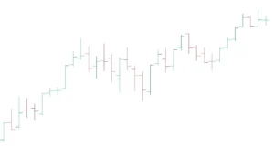
Bar Chart
Bar charts are the extension of a line chart that reads all four parameters eg, open, high, low, and close of price over a selected time period. These are more complex than line charts, providing traders and investors with additional information about the movement of security prices.
A bar chart uses vertical and horizontal lines to represent price data. The vertical line represents the price range over a specific time interval. A vertical line has two ticks-like horizontal shorter lines attached to it representing the opening and closing of the price.
Both the horizontal lines are on opposite sides of the vertical line. The left line represents the open while the right line indicates the close of the price of the particular time period.
I hope you understand what is a bar chart here.
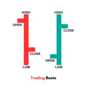
If the open price is higher than the closing price, the left line will be higher than the right line, and red colored bar is formed called a bearish bar. Similarly, if the open price is lower than the close price, the left line will be lower than the right line, and a green bar is formed called a bullish bar.
Candlestick Chart
Candlestick charts represent data similar to bar charts and the most popular chart type used by technical analysts.
In the candlestick chart, the candle has two parts one is the body and the other is a wick, also known as the shadow. It contains a cylindrical body whose endpoint represents the open and close.
There are vertical lines attached to the cylindrical body which represents the high and low of the specific time period. These vertical lines are called the shadow.
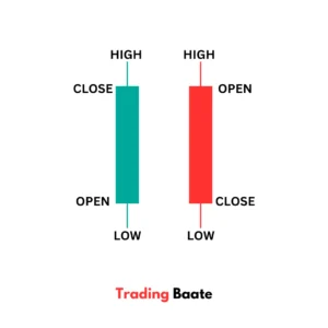
There are two shadows attached lower and upper to the body. The upper shadow represents the high and the lower shadow represents the low of a specific time period.
The colors of the candles depend on the opening and closing of the price. If the open price is higher than the close price then red-colored cables are formed and if the open price is lower than the close price then a green-colored candle is formed.

How to Choose a Chart Type
We have discussed important chart types and out of these, the most commonly used chart type is the candlestick chart as it provides complete information about the open, high, low, and close of price of a particular time period.
The decision between these chart kinds depends on your personal analytical tastes and demands, timeframe, and the level of complexity of analysis.
The line chart is used to identify price trends as well as to draw support and resistance lines on the chart. It simplifies the data but does not provide as much detail as the bar and candlestick charts.
Out of the bar chart and candlestick chart, the candlestick chart is preferred because it indicates the high, and low with the wick on the upper and lower of the candle. Also, the body represents the opening and closing of the price in a particular time period depending on the selected timeframe.
Candlestick charts make the price action easy to understand and various candlestick types are used to decide whether to long or short.
Each chart type has its benefits and strengths. We can select charts according to our analytical needs and understanding.
Price Chart
Price Chart includes two parameters eg Time and Price. Time is represented on the x-axis and price is represented on the y-axis of the chart.
TIME: X-Axis (Left to Right)
We can select the time based on our trading style. If we are an intraday trader then we use a shorter timeframe eg 5min, 15min or if we are a positional trader then we prefer a daily and weekly timeframe chart. A monthly timeframe chart is used for long-term investment planning
Each candle represents the open, high, low, and close of a particular time period which is selected on the chart. If the timeframe selected is daily, this means that each candle represents a one-day price movement.
PRICE: Y-Axis (Top to Bottom)
The price is plotted on the vertical axis. In each candle, the four components of price are the following:
OPEN
This is the price from where the formation of candles of a particular time period started.
HIGH
The highest price traded during that period.
LOW
The lowest price traded during that period.
CLOSE
This is the price at which the candle is completed.
The color of the candle is used to differentiate between the open and closed price of the candle. If the color of the candle is red, this means that the price falls in the particular candle and the open price is higher than the close price.
If the color of the candle is green, this means that the price rises in that particular candle, and the open price is lower than the closing price.
Last Words
We learned different types of charts in technical analysis, with their most common types and with a perfect pairing concept called Charting and Technical Analysis with chart reading skills. I hope you learned something new today.
Disclaimer
This article is for educational purposes only and is written based on the author’s knowledge and experience in the stock market.
We are not responsible for external link data, as we do not have control over them, We use them as references only, sp verify them before acting on them.
Great article! I appreciate the clear and insightful perspective you’ve shared. It’s fascinating to see how this topic is developing. For those interested in diving deeper, I found an excellent resource that expands on these ideas: check it out here. Looking forward to hearing others’ thoughts and continuing the discussion!
The insights shared in this article are really valuable. The author’s approach to the topic was refreshing. I’m eager to hear different perspectives on this. What did you find most compelling?
This article provided a lot of valuable information. The author’s perspective was both refreshing and enlightening. It would be interesting to hear how others feel about these points. Any thoughts?
This is a fantastic overview of the various types of charts in technical analysis! The explanations are clear and concise, making it simple to understand how each chart type works and its specific uses. You’ve done an excellent job of offering helpful ideas for both beginners and experienced traders. Keep up the excellent work!
Loved this article! It’s both insightful and entertaining.